What Makes a Cigar Band Tell a Story? 3 Lessons From Davidoff Winston Churchill
Some cigar bands describe a cigar. The best ones describe the person holding it. Walk past a humidor full of premium sticks — most of them dressed in the same black-and-gold tuxedo — and one band breaks ranks. White paper. Gold trim. A dotted oval surrounding a single silhouette: a man in a fedora with a bow tie and a cigar in profile. There’s no name spelled out. There doesn’t need to be.
That band is the Davidoff Winston Churchill. It’s a study in tribute as design language — the rare cigar band that doesn’t hand you a brand, it hands you a character. The customer fills in the legend. That trust between band and smoker is the entire mechanism, and once you see how Davidoff built it, you can’t un-see it.
For anyone designing a premium cigar band for their own brand — or thinking about elevating the one they already have — the Davidoff Winston Churchill band is one of the most instructive case studies in the modern humidor. Three deliberate choices. One unmistakable signal. Here’s what it teaches us, and how to apply the same principles to your own cigar.
Why Cigar Band Storytelling Matters More Than You Think
A cigar band is the smallest piece of real estate in your entire brand — and the most powerful narrative tool you own. The wrapper goes to the ashtray. The box stays on a shelf at home. But the band travels. It sits between two fingers at a wedding toast, a closing dinner, a back-porch conversation that runs past midnight. It gets photographed. It gets remembered.
Most custom cigar bands try to use that real estate to describe. Country of origin. Vintage year. Blend code. Wrapper notation. The band ends up looking like a label on a wine bottle — informational and forgettable. It tells you what’s in the cigar but never tells you what the cigar is.
The bands that actually move product do something different. They tell a story. Sometimes the story is a place; sometimes a process; sometimes a person. The Davidoff Winston Churchill band tells a story by trusting the customer to know the protagonist — and that trust is what makes it feel less like packaging and more like a small portrait of who you become when you light it. That’s the difference between a luxury cigar band and a band that’s merely expensive. Luxury is narrative. Expense is just material.
A Case Study in Tribute: Davidoff Winston Churchill
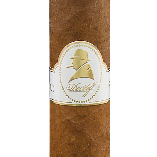
The Davidoff Winston Churchill line is a tribute to Sir Winston himself — the statesman who smoked an estimated quarter of a million cigars in his lifetime and made the long, full-bodied smoke a permanent piece of his public image. The cigar inside is a medium-to-full-bodied blend of Nicaraguan, Dominican, and Mexican tobaccos. The band on the cigar is a study in iconography.
The band itself is almost startlingly minimal. A cream-white field. A gold-bordered dotted oval positioned slightly off-center. Inside the oval, a gold silhouette of a man in profile — fedora, bow tie, cigar held just below the chin. Beneath the oval, in small understated type: “Winston Churchill.” That’s the entire mark. No filigree. No crest. No country callouts. The composition trusts the silhouette to do the work, and it delivers.
What makes the band remarkable isn’t any single element — it’s the discipline of what’s missing. Three deliberate choices that signal premium without raising their voice. Here are the three lessons sitting inside the design.
Lesson 1 — A Silhouette Is a Story Compressed
The Davidoff Winston Churchill band performs a trick almost no other cigar band attempts: it gets the customer to do the storytelling. The silhouette is just a few gold shapes — the curve of a fedora brim, the angle of a bow tie, the line of a cigar — and the eye instantly assembles them into a face you know. You don’t see a silhouette. You see Churchill. The band has compressed a century of history into a single profile.
This is visual compression, and it’s the most underused tool in cigar packaging. Most bands write the name of the thing they want you to remember. The strongest bands show you something that triggers the name in your head. The first kind is read. The second is recognized. Recognition is faster, more emotional, more memorable.
The lesson is simple: if your story can be drawn instead of written, draw it. A silhouette forces the design to commit to one idea completely. There’s nowhere to hide a weak story inside an outline — either the shape is recognizable on its own, or the design fails. Davidoff’s shape is recognizable on its own.
When a Portrait Belongs on a Cigar Band
Not every brand has a Churchill. A portrait or silhouette belongs on your band when the figure is genuinely connected to the cigar’s story — a founder, a master blender, a historical patron, a regional icon. The figure has to be recognizable and tied to the brand in a way a customer can articulate after a glass of bourbon. Reach for a generic portrait to look prestigious and the design reads as costume. Pick a figure with real connection and it reads as homage.
Execution matters as much as choice. Realistic portraits date a band quickly — illustration styles cycle in and out of fashion every twenty years. Silhouettes age slowly. The same Churchill silhouette would have worked on a band in 1965 and will still work in 2065. Iconography compounds. Illustration depreciates. Reduce the figure to its most essential outline — hat, profile, gesture — and let recognition fill in the rest.
Lesson 2 — White Space Is Luxury
Look at the Davidoff Winston Churchill band and count the elements. There’s a dotted oval. There’s a silhouette inside it. There’s a small name beneath it. That’s essentially the whole design. The rest is white space — deliberate, generous, almost confrontational emptiness.
Most cigar bands are afraid of empty space. The reflex is to fill it — a crest, a ribbon, a country flag, a vintage year, a flourish in the corner. The result looks busy and ends up looking cheap, because density without hierarchy reads as clutter. Davidoff went the other direction. They treated the white space as the frame itself — the silhouette is precious precisely because so much of the band is empty around it.
It’s the same principle that makes Tiffany’s little blue box feel luxurious before you’ve opened it. The signal isn’t the box; it’s the absence of everything else. White space, used confidently, tells the customer: we don’t need to add more, because what’s here is enough. That’s the most expensive thing a design can communicate.
Designing With Negative Space
If you’re drafting a custom cigar band design and want to use white space the way Davidoff does, the first move is to delete. Take everything you think the band needs and cut it in half. Then cut it in half again. Cigar bands fail almost universally on the side of having too much, not too little. Negative space is the discipline of removing every element that isn’t carrying its weight.
The second move is to give your remaining mark a frame. The dotted oval on the Davidoff band isn’t decoration — it’s a perimeter that protects the silhouette from surrounding emptiness. Without the oval the silhouette would float and look unanchored. With it, the negative space outside becomes a feature, not an accident. Resist the temptation to fill that space with subtle background patterns at low opacity — that’s a designer hedging. Either commit to a pattern as a foreground element or commit to the empty field. Half-measures look like wallpaper.
Lesson 3 — Gold on White Is a Different Kind of Premium
Open any humidor in any cigar lounge in the world and you’ll see the same color story repeated across most premium cigar bands: black background, gold accents. It’s the default. It’s the tuxedo of cigar packaging. And because it’s the default, it’s also the way to disappear into the rest of the case.
Davidoff broke that convention forty years ago and has stayed broken ever since. The Winston Churchill band is cream-white paper with gold foil and gold emboss. No black. No oxblood. Just the cleanest field with the warmest metallic. It reads as daylight luxury instead of nightclub luxury — library leather rather than club banquette.
The technical execution is what makes the choice work. White paper exposes every flaw — misregistration, foil tearing, embossing dimples, ink smudge. Black paper hides those flaws. Davidoff committed to white because they could afford to: their printing tolerances are tight enough that the band looks immaculate up close. That precision is part of what the customer is paying for, even if they couldn’t name it.
When to Break the Black-and-Gold Convention
You don’t have to be Davidoff to break the black-and-gold default, but you do have to break it for a reason. The convention exists because it works — black background plus gold foil is reliably luxurious, and a brand can ride that signal without having a strong point of view. Breaking it requires substituting a stronger signal in its place.
If your brand wants to read as daylight luxury — drawing-room rather than nightclub — white paper with gold foil works beautifully, provided your printing is clean enough to survive the scrutiny. If you want agricultural craft, cream paper with deep brown or oxblood ink (no foil at all) reads as land and harvest. If you want modernist, white paper with a single saturated color and zero metallic finishes can land hard. Plasencia Alma del Fuego does this with coral red and white.
Black-and-gold is a costume anyone can wear. A non-default palette is a position only your brand can occupy — if you commit to it with the production quality required to make it look intentional. Foiled and embossed cigar band finishing works as beautifully on cream paper as on black. The choice is yours; the discipline is the same.
How to Apply These Lessons to Your Own Cigar Brand
If you’re designing a premium cigar band for a new line — or rethinking the one you have — here’s how the three Davidoff Winston Churchill lessons translate into a working brief for your own band.
Decide who your band describes. Davidoff’s band doesn’t describe the cigar; it describes the person holding it. Decide whether your band is a label (about the contents) or a portrait (about the customer). Both can work, but the design choices flow from the answer.
Trade words for shapes. Every word on a band is one less millimeter of real estate. Words are expensive currency because the customer has to stop, read, and decode them. Shapes — silhouettes, monograms, symbols — are recognized instantly and remembered longer. Audit your design: can this word become a shape?
Give the central mark space to breathe. Circle every decorative element that isn’t the central mark, then delete half of them. The remaining elements should frame the mark, not compete with it. White space should occupy at least 40 percent of the band area — less than that and the design feels anxious.
Commit to your palette like you mean it. The fastest way to make a band look budget is to hedge your color choices. Pick one background color and one metallic finish and commit. If you go white, your printing has to be spotless. If you go a third color — coral, oxblood, hunter green — your reasoning has to be visible in the rest of the brand. Color confidence is the cheapest luxury upgrade available.
Frequently Asked Questions About Premium Cigar Band Design
What makes a cigar band tell a story?
A cigar band tells a story when it gives the customer a recognizable cue — a portrait, a silhouette, a symbol, a place name, an era — that lets them complete the narrative themselves. The Davidoff Winston Churchill band is the cleanest modern example: a gold silhouette of a man in a fedora and bow tie, with no name spelled out, because the silhouette itself tells you who’s smoking it. Storytelling on a band is iconographic compression. Show one image that triggers the story, and trust the customer to fill in the rest.
How much does a custom cigar band cost?
Custom cigar band pricing depends on volume, finish, and complexity. Flat-printed bands run a few cents per unit at high volume. Foiled and embossed bands cost roughly 30 to 60 percent more per unit, with diminishing per-unit cost as volume increases. Most boutique cigar brands order in batches of 1,000 to 10,000 bands. Higher-end finishes — multi-color foil, multi-level emboss, specialty papers, white-paper printing with tight registration tolerances like Davidoff uses — add cost but dramatically increase perceived value at retail.
Why does Davidoff use white instead of black on the Winston Churchill band?
Davidoff chose white to break the default cigar-luxury palette and signal a different kind of premium — library and drawing room rather than nightclub. White paper requires tighter printing tolerances than black because every flaw in registration, foil application, or embossing is visible. Davidoff’s commitment to white is a quiet announcement that production quality is high enough to survive the scrutiny.
What is a foiled and embossed cigar band?
A foiled and embossed cigar band uses two finishing techniques together. Foil stamping applies a thin layer of metallic foil to specific elements under heat and pressure, creating reflective accents that change as the cigar rotates. Embossing uses a metal die to raise design elements off the paper surface, creating tactile relief. The Davidoff Winston Churchill band uses gold foil for the silhouette and dotted oval, with subtle embossing that gives both elements physical depth.
Should my cigar band include a portrait or silhouette?
A portrait or silhouette belongs on your band when the figure has a genuine connection to the cigar — a founder, a master blender, a historical patron — and when the figure’s outline is recognizable on its own. Avoid generic illustrations of nameless figures; customers read those as costume. Prefer silhouettes over detailed portraits because silhouettes age slowly while illustration styles cycle. Give the mark a clear perimeter and surround it with generous white space.
Ready to Design a Band That Tells Your Story?
At Cigar Bandz, we craft foiled and embossed cigar bands using the same finishing techniques you see on Davidoff, Padron, Plasencia, and the rest of the heritage names — including the tight-tolerance printing required to make a cream-and-gold band look as composed as a Winston Churchill. Whether you’re launching a new line or refreshing an existing brand, the difference between “a cigar” and “your cigar” lives on a quarter-inch of foiled paper.
If you’re ready to talk through what your band could look like — the mark, the silhouette, the palette, the finish — we offer a free 30-minute consultation. No obligation, no template pitch.
Book a free consultation with Cigar Bandz
A great cigar band doesn’t describe the cigar. It tells you who lit it. What does yours say about the person holding it?

All rights reserved. © 2023 Cigar Bandz. No part of this website may be reproduced, distributed, or transmitted in any form or by any means without the prior written permission of Cigar Bandz. Unauthorized use is strictly prohibited.
+1 321-321-2720
Products & Services
Additional Information